 Poke Fun Play
Pokémon coloring patterns and palette ideas
Use the coloring studio’s ten pattern choices and six palettes to plan a readable Pokémon picture, experiment with texture and save your work.
Choose a small palette first
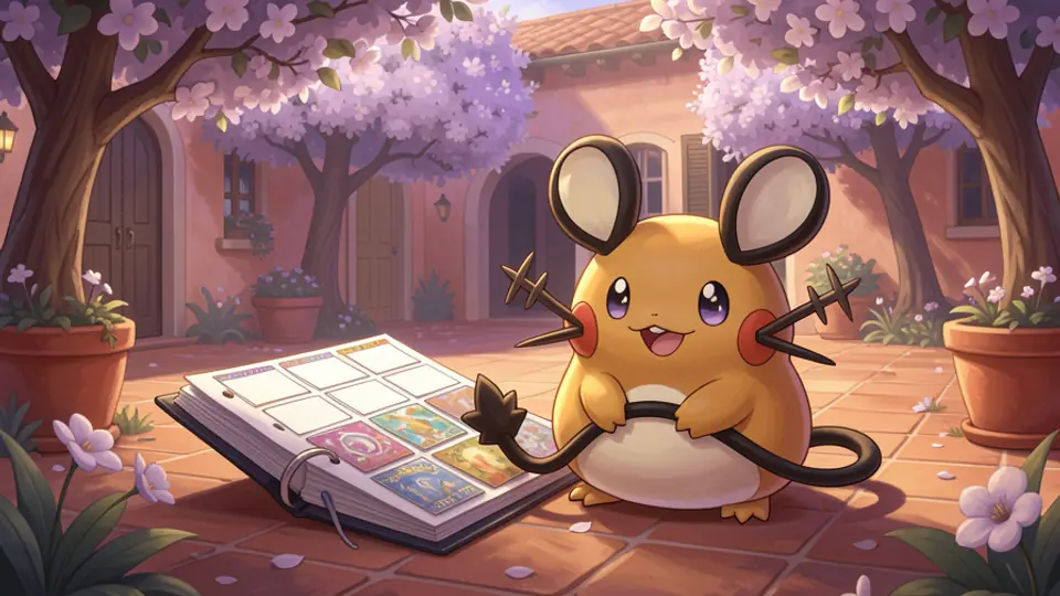
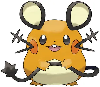
Start with three roles: a main color, a contrasting detail color and a quiet color for larger areas. You can add more later. This gives a Pokémon outline a clear focal point before patterns compete for attention. On a Dedenne picture, decide whether the face, ears or surrounding space should attract the first glance, then reserve your strongest contrast for that area.
The studio offers six named palettes: Pokémon classics, Soft pastels, Ocean & sky, Forest trail, Sunset glow and Neon night. A custom color picker lets you step outside those swatches. These are creative starting points, not promises that every swatch reproduces a Pokémon’s official colors. Compare an appropriate reference if you want a familiar or shiny variation.
Explore all ten pattern choices
The pattern controls are solid, dots, stripes, stars, checkerboard, grid, crosshatch, waves, zigzag and hearts. Solid paints a continuous color. The others repeat colored marks with white spaces between them. Fill and freehand painting use the selected pattern, so one choice can create both a large textured region and smaller hand-painted details.
Match the pattern’s density to the space. Waves can suggest movement around a Squirtle picture, while dots or hearts can make a playful accent. Grid and crosshatch produce busier textures; try them in a broad area before applying them to small features. A pattern’s white gaps are part of its appearance, so two adjacent patterned regions may need stronger color contrast than two solid regions.
Keep important details readable
Try solid color for small facial features and a pattern for one larger region. This is a useful constraint when you are learning the tools: it makes the effect easy to assess and leaves the outline recognizable. For a second version, reverse that balance or change only the accent color. Comparing two deliberate variations teaches more than changing everything at once.
The fill tool works within areas separated by the dark outline. Very small spaces may be easier to work on after zooming in. Use the hand tool to move the view, then return to a painting tool. If an area fills differently than expected, undo and try a smaller detail with a brush rather than repeatedly covering the whole picture.
Test a mood without losing the subject
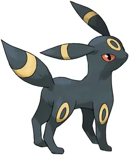
Soft pastels can support a gentle picture; Ocean & sky provides blues and aquatic accents; Forest trail offers greens and earthy colors. Sunset glow and Neon night invite stronger departures from familiar colors. Treat those associations as suggestions. An Umbreon picture could use a quiet background and one bright accent, while Dedenne could carry a warm palette with a contrasting patterned patch.
Drafts save in this browser on this device. Download a PNG when you want a separate copy, or print the current picture using the studio’s Print control. The saved output combines your colors with the outline on a white background. A browser draft is not a cloud backup, so download work you want to keep before clearing site data or switching devices.
By the Poke Fun Play editorial team. Facts checked October 5, 2026; analysis and collecting suggestions are our own.
Sources & further reading
- Poke Fun Play: coloring studio and pattern controls · Checked 2026-10-05
- Poke Fun Play: browser saves and coloring privacy · Checked 2026-10-05
Explore the Pokémon
 Dedenne
 Squirtle
 Umbreon
Keep exploring
Related articles
 Site guides
Pokémon binders: card collections and Pokédex placeholders
Choose between organizing individual Pokémon TCG printings and planning a species-based National Pokédex binder with printable placeholders.
Read article → Site guides
Choosing a Pokémon poster for your space
Compare generation, artwork style and listed sizes in the verified Etsy catalogue before choosing a digital Pokémon poster for a wall or display.
Read article → Site guides
Make a game night with local two-player Pokémon games
Plan a shared-device game night with Pokémon Tic-Tac-Toe, Pokéball Connect and Poké Hockey, with clear turn-taking and a simple homemade scorecard.
Read article →Related retailers
Coloring books on Amazon · Pokémon cards on TCGplayer
Paid links. As an Amazon Associate I earn from qualifying purchases. We may earn a commission from purchases through our TCGplayer links.